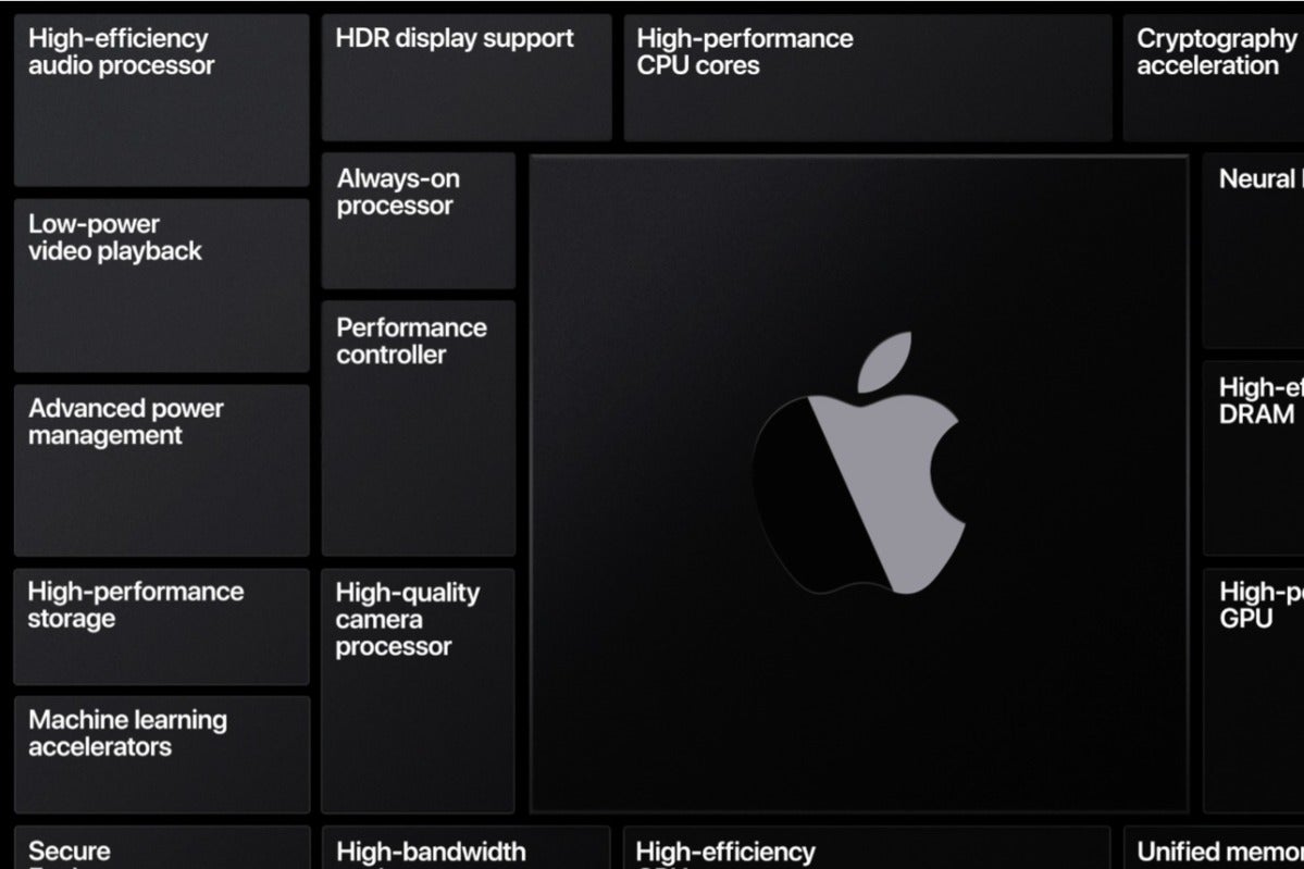
I think the large radii round rectangles look less professional than, for example, the small radii on the CPU graphics used by Apple. I’d rather see them adopt this design language in the future than the floating dock with fisher-price icons.

I think the large radii round rectangles look less professional than, for example, the small radii on the CPU graphics used by Apple. I’d rather see them adopt this design language in the future than the floating dock with fisher-price icons.
